Introduction
Layout is an invisible element that plays a powerful role in how a children’s book is experienced. Even if the story is great, a poor layout can make the book confusing and less engaging. On the other hand, a well-structured layout makes reading smooth, enjoyable, and visually appealing.
In children’s books, layout becomes even more important because kids rely heavily on visuals and spacing. A clean and balanced design helps them follow the story easily and stay engaged from start to finish.
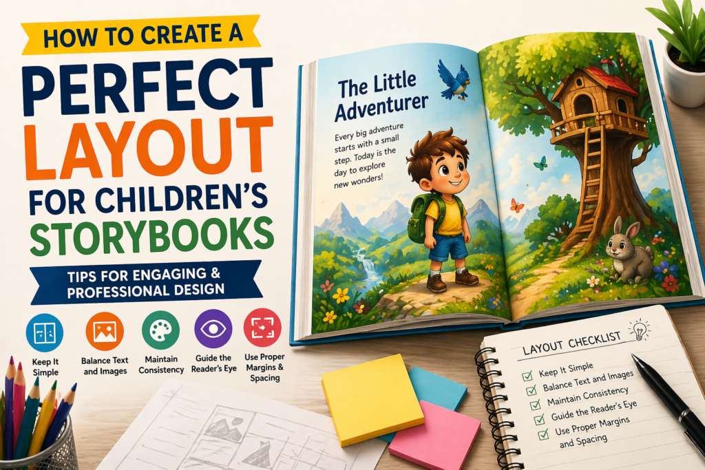
1. Keep It Simple
Simplicity is the foundation of a good children’s book layout. When a page has too many elements, colors, or text, it can overwhelm children and make it difficult for them to focus on the story.
A simple layout does not mean boring—it means clear and well-organized. Each page should have limited content so that the reader can easily understand what is important. Using white space also improves readability and gives the design a clean, professional look.
👉 A simple layout helps children focus better and enjoy the reading experience.
2. Balance Text and Images
In children’s books, text and images should work together like a team. Too much text can make the book feel boring, while too many images without proper context can make the story unclear.
The text should be short and easy to understand, while the illustrations should support and enhance the story. Each image should have a purpose and help convey emotions or actions. When both elements are balanced, the story becomes more engaging and easier to follow.
👉 A good balance between text and visuals creates a strong storytelling experience.
3. Maintain Consistency

Consistency is what makes a book look professional and polished. If every page uses different fonts, colors, or styles, it can feel disconnected and confusing for the reader.
Maintaining the same font style, color palette, and illustration style throughout the book creates a smooth and unified experience. It also helps build a visual identity for the story. Consistency allows children to stay focused without unnecessary distractions.
👉 Consistent design improves readability and gives your book a professional finish.
4. Guide the Reader’s Eye
A good layout naturally guides the reader on where to look first and how to follow the story. Children should be able to move from one element to another without confusion.
Design your pages in a way that follows a natural reading flow (left to right). Highlight important elements and avoid placing too many distractions on the page. Proper placement of text and images helps create a smooth and intuitive reading journey.
👉 A well-guided layout makes reading effortless and enjoyable for children.
5. Use Proper Margins and Spacing
Margins and spacing are often overlooked, but they are essential for a clean and readable design. When text is too close to the edges or spacing is too tight, the page looks cluttered and uncomfortable to read.
Proper spacing gives your content “breathing room,” making it easier for children to focus on both text and images. It also ensures that nothing gets cut off during printing. A well-spaced layout looks neat, balanced, and professional.
👉 Good spacing enhances readability and improves the overall look of your book.
Conclusion
Creating a perfect layout for a children’s book is all about simplicity, balance, and consistency. A well-designed layout not only makes your book look attractive but also improves the reading experience for young readers.
When children can easily follow the story without confusion, they are more likely to stay engaged and enjoy the book. That’s why layout design should always be given proper attention.