Introduction
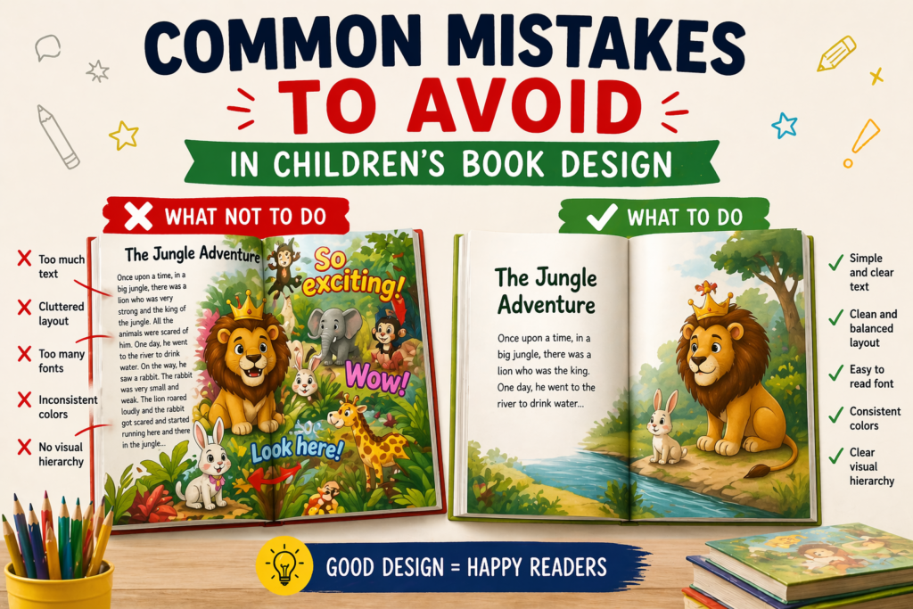
Designing a children’s book may look simple, but many beginners make common mistakes that reduce the overall quality of their book. These mistakes can make a book look unprofessional, confusing, and less engaging for young readers.
Even a great story can fail if the design is not done properly. That’s why understanding and avoiding these mistakes is very important for creating a successful children’s book.
1. Overloading Pages
One of the most common mistakes is adding too much content on a single page. When a page has too many elements, colors, or text, it becomes difficult for children to focus on what is important.
Children prefer simple and clean visuals. Overloading a page can confuse them and reduce their interest in reading the book. A cluttered design also looks unprofessional and messy.
👉 Keeping your pages clean and focused improves readability and engagement.
2. Poor Quality Illustrations

Using low-quality or inconsistent illustrations can damage the overall look of your book. If characters look different on every page or the artwork is unclear, it breaks the connection with the story.
High-quality illustrations should be clear, expressive, and consistent. They should match the tone of the story and help children understand emotions and actions easily.
👉 Good illustrations build trust and make your book visually appealing.
3. Wrong Font Choice

Choosing the wrong font can make your book hard to read, especially for young children who are still learning. Decorative or overly stylish fonts may look attractive but often reduce readability.
Fonts should be simple, clear, and large enough to read comfortably. Proper spacing between letters and lines is also important for a smooth reading experience.
👉 A readable font ensures children can enjoy the story without difficulty.
4. Inconsistent Design
Inconsistency in design can make your book look unprofessional and disconnected. If every page has a different style, color scheme, or layout, it becomes confusing for the reader.
Maintaining consistency in fonts, colors, and illustration style creates a smooth and enjoyable reading experience. It also helps in building a strong visual identity.
👉 Consistency gives your book a polished and professional look.
5. Ignoring Target Audience
Designing without understanding your target audience is a major mistake. Different age groups have different preferences, reading abilities, and attention spans.
A design suitable for toddlers may not work for older kids, and vice versa. It is important to choose visuals, fonts, and layouts based on the age group you are targeting.
👉 Audience-focused design increases engagement and success.
Conclusion
Avoiding these common mistakes can greatly improve the quality of your children’s book. Small design errors can have a big impact on how your book is perceived by readers.
By focusing on simplicity, quality, consistency, and audience needs, you can create a book that is both engaging and professional.
Pingback: The Importance of Professional Children’s Book Design: A Complete Guide for Authors in 2026
Pingback: Best Childrens Book Layout: Amazing Ideas for Professional Book Designs 2026 -
Pingback: Amazon KDP Publishing Guide for Beginners & Authors in 2026
Pingback: Create eBook with AI Free for Beginners & Publishers | 2026
Pingback: Typography and Computer Application for Publishing | 2026
Pingback: Illustration Design Ideas for Graphic Designers | 2026