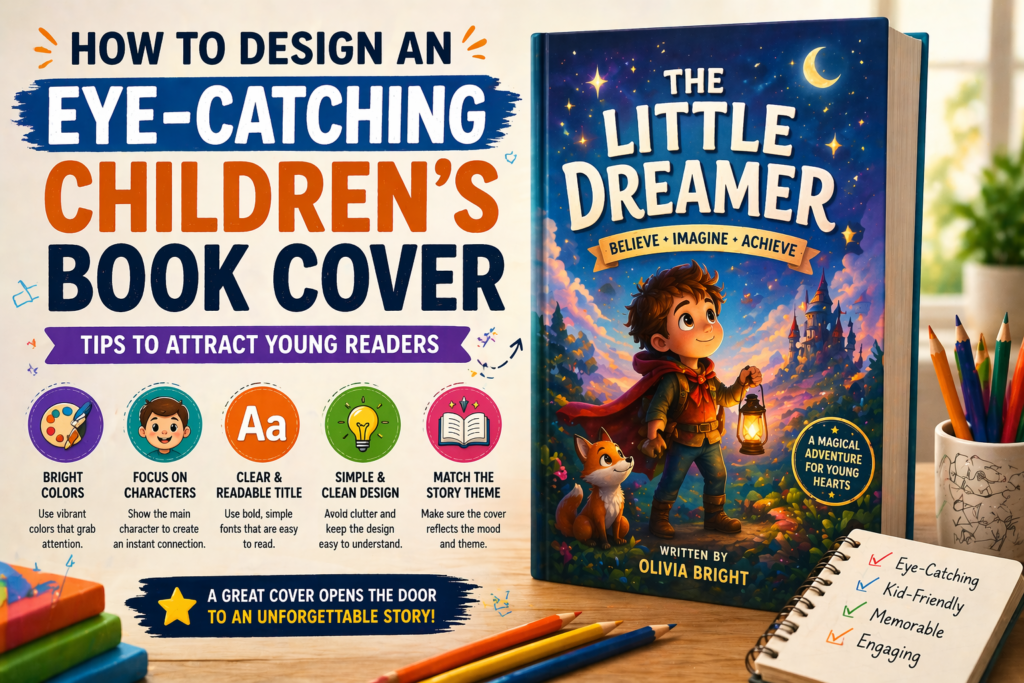
Introduction
A book cover is the first thing a reader notices. For children’s books, it becomes even more important because kids are naturally attracted to bright colors and fun visuals.
A well-designed cover can grab attention instantly, while a poor cover can make even a great story look uninteresting. That’s why designing an eye-catching cover is essential for success.
1. Use Bright and Attractive Colors
Colors are the first thing that attracts children to a book. Bright and vibrant colors create excitement and curiosity, making kids more likely to pick up the book.
However, it is important to use colors wisely. Too many random colors can look messy, so maintaining a balanced color palette is important.
👉 Colors should attract attention without overwhelming the viewer.
2. Focus on Main Characters
The main character should be clearly visible on the cover. Children connect emotionally with characters, so showing them on the cover builds interest instantly.
Make sure the character is expressive and reflects the story. This helps readers understand what the book is about at a glance.
👉 A strong character presence makes your cover memorable.
3. Keep the Title Clear and Readable
The title should be easy to read, even from a distance. Avoid using overly decorative fonts that reduce readability. Use large, bold fonts that match the theme of the book. Proper spacing and contrast also improve visibility.
👉 A clear title ensures your book stands out on shelves and online.
4. Create a Simple and Clean Design
Avoid overcrowding your cover with too many elements. A simple design looks more professional and is easier to understand. Focus on one main idea or scene that represents the story. Clean design helps the viewer quickly understand what the book is about.
👉 Less clutter = more impact.
5. Match the Story Theme

Your cover should reflect the story inside. If it’s a fun story, the cover should feel playful. If it’s educational, it should look informative. Matching the theme helps set the right expectations for readers and builds trust.
👉 A theme-based design makes your book more appealing.
Conclusion
An eye-catching cover is the key to attracting readers and increasing sales. By using bright colors, clear typography, and strong visuals, you can create a cover that stands out.
A good cover doesn’t just look beautiful—it tells a story at first glance.