Introduction
A book cover plays a crucial role in attracting readers, especially in children’s books where visuals matter the most. Many authors put a lot of effort into writing the story but ignore the design of the cover, which can reduce the chances of their book being noticed.
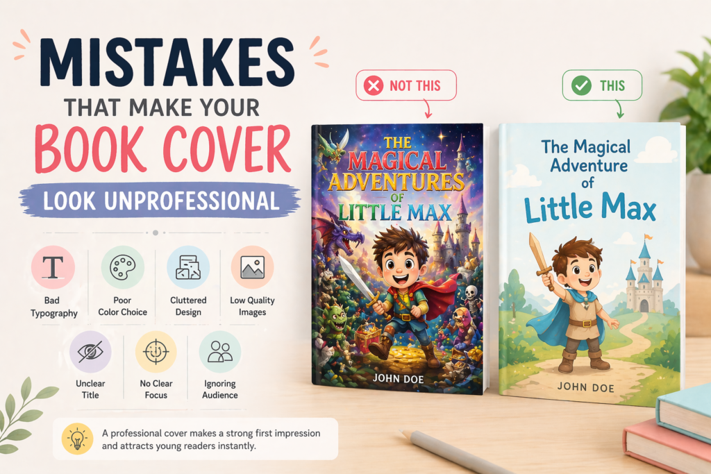
A poorly designed cover can make your book look unprofessional, even if the content inside is excellent. That’s why understanding and avoiding common design mistakes is very important.
1. Using Too Many Fonts

Using too many different fonts on a book cover creates confusion and makes the design look messy. When fonts don’t match each other, it becomes difficult for the reader to focus on the title.
A professional cover usually uses one or two fonts that complement each other. Consistent typography helps create a clean and organized look. It also improves readability, especially for children.
👉 Stick to simple and limited fonts for a polished design.
2. Poor Color Choices
Colors play a major role in attracting attention, but using the wrong color combination can make your cover look dull or confusing. Clashing colors or very dark tones may not appeal to children.
A good color palette should be bright, balanced, and suitable for the story’s theme. Proper contrast between text and background is also important for readability.
👉 Smart color choices make your cover more attractive and engaging.
3. Cluttered Design
Adding too many elements, characters, or text on the cover can make it look cluttered and confusing. When everything is highlighted, nothing stands out.
A clean and simple design helps the viewer quickly understand the main idea of the book. It also gives a more professional and modern look.
👉 Focus on one main element and keep the design clean.
4. Low-Quality Images
Using low-resolution or blurry images can make your book look cheap and unprofessional. Poor image quality reduces the overall impact of your cover.
High-quality illustrations and images are essential for creating a premium look. They should be sharp, clear, and visually appealing.
👉 Always use high-resolution visuals for a professional finish.
5. Unclear or Hard-to-Read Title

If your title is not clearly visible, readers may ignore your book completely. A small or overly decorative font can make the title difficult to read.
The title should be large, bold, and easy to understand at a glance. It should stand out clearly from the background.
👉 A readable title is essential for grabbing attention.
6. No Clear Focus Point
A cover without a clear focal point can confuse the viewer. If there is no main element, the design looks scattered and unclear.
A strong focal point—like a main character or key scene—helps guide the viewer’s attention. It makes the cover more visually appealing and easier to understand.
👉 Always highlight one main element to create impact.
7. Ignoring the Target Audience
Designing without considering the target audience is a major mistake. Different age groups have different preferences and understanding levels.
A cover designed for toddlers should be bright and simple, while a cover for older kids can be more detailed. Matching the design with the audience ensures better engagement.
👉 Always design according to your target readers.
Conclusion
Avoiding these common mistakes can significantly improve the quality of your book cover. A well-designed cover not only looks professional but also increases the chances of attracting readers.
By focusing on simplicity, quality, and audience needs, you can create a cover that stands out and leaves a lasting impression.
Pingback: Childrens Book Cover Design: Creating Covers That Attract Young Readers 2026 -